Visual treat: Juventus identity refreshment - altereffekt.
Juventus just published the sensational reinvention of its identity, which in itself has a drastic and brave change of the logo, combining the insignia with a newly introduced monogram, a movement which absolutely cannot be ignored from its importance to the whole brand establishment. The new identity was created by Interbrand office in Milan.
How legible the change is, it’s not to be judged at the moment and also it does not depend solely on the technical part, but much more on the way the brand is going to be introduced in the future and especially its fate will be tied to the club’s success in the years to come. The truth is there is a refusal to it at first, which might be seen as a natural reaction in front of such an opposite step, but past experiences assure us that everything which will be repetitively introduced transforms into an accepted norm, no matter its reactionary refusal at first impression. However, this concept in itself actually lowers down the pressure and importance of the visual aspect on the other hand.
My goal was to complete a short visual study of the new logo and to clarify the visual impression it transmits. On this occasion I have avoided consulting any similar analysis from other possible sources, contacting only exact informative data about the changes, so that I can share my viewpoint regarding the new look more directly and with much more authenticity.
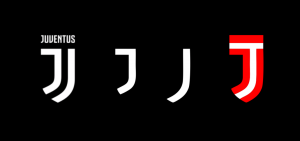
In general, the logo itself continues to be an emblematic one, but now its shape is not oval anymore and it gets combined or more precisely it is being created through a monogram which tries to play the role of the insignia at the same time. A move which represents a directional change from the graphic details of the later heraldic, keeping only the lettering, but of course with a new original typeface created exclusively for this occasion.
The Monogram
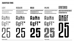
The first thing to be noted is that, while moving away from graphical elements, Juventus adopts a monogram through its initial letter J. Its graphic treatment by the style of the shapes goes in hand with those of American football teams and in general with the American sports style. This impression in large amount is due to the ‘slab-serif’ form of the typography, but only for the letter ‘J’ in the monogram, which should not be confused with J of the ‘typeface family’, which are different in style and shape and their study would make a separate analysis. While we’re here, take a look at the complete series of the type family, generously named in appreciation for the supporters as “JUVENTUS FANS”.
Let’s get back to the monogram. In fact here we notice three J’s, two of which white and one being created out of the negative space, where both white J’s stand on the side and the lettering (JUVENTUS) on the top serve as outlines. The outline of course is not complete and does not encircle the third J on all sides, a detail which gives it the retro graphical style of the 70s and 80s (design trends of that era, with the first examples coming to my mind being the logotypes of Mexico70 and Mexico80). A similar version to this style is part of the custom typeface family under the mode “Inline”.
Taking this approach, Juventus joins other teams Italy, in which the logo is a combination of a heraldic and a monogram; such are the cases with the football clubs of Inter, Livrono, Napoli, Vicenza, etc. The thing that undoubtedly singles Juve out is the minimalist (decomposition to essential forms) take on the interpretation of these elements.
Symmetry and the optical illusion
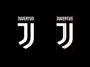
The most delicate part, which hurts the eye from the first encounter is the way this decomposition (minimalism) of the emblem and the desire to create it through the initial letter J have made the symmetric stance and the balance of the logo in general quite difficult.
First impression that must be confronted is the illusion of the heraldic not being symmetric and that it weighs on the right side. This appearance looks so real that even though I couldn’t believe that is truly the case, still had to measure it to assure myself.
This illusion appears because of the fact that the heraldic is empty of white shapes on the left side and it singles it out in comparison to the right side where we see more elements gathering, a reason which weighs the composition on the right side. To avoid this illusion of asymmetry we need longer and enforced observation.
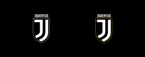
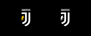
The other reason of this illusion is the perception of the J, whom the eye has tendency and is accustomed to perceive easier and faster than the emblematic form, which in Juventus’ case it’s not even oval anymore (another innovation in itself) and which misses outline border of some kind or an inside element in the empty space on the left. The first example below illustrates how an outline could improve the appearance of the symmetry. I believe something similar to this will be the application on the kits for the next season.
The other example acquires this so needed balance by inducing the Juve symbolism from previous logos, which could also see a cut on the side in border with the emblematic form to get the best impression. However this move would drive away the logo from its fundamental goal, which is to remain a minimalist monogram emblem.
This sensitive detail most probably will see a solution on the application for the official next season kit and I am curious to see what will it be. However, without an outline, without any kind of space fill on the empty left space, it will continue to weight on the right and as such it will continue to appear as J instead of as complete heraldic, until we’re accustomed to accept this as something normal.
All in all, this brave step has to be greeted, which in it also bears the tendency to position itself as a leader of an eventually new emerging trend (a game in which Barcelona was quite successful in the last decade, especially though the introduction of the innovative kits, as the fluorescent ones for instance), especially in these difficult conditions for graphical execution of the idea, which unfortunately doesn’t seem to be the perfect solution.
*Marrja e përmbajtjeve të plota apo pjesore të artikujve lejohet vetëm me shtimin e referencës për postimin origjinal në blog.


